![]()
Good Morning POU! OK, the topic today is still an extension of our Black Industrial Designers focus and VERY interesting. We will get into why this post is titled the way it is, a little later. First up, a spotlight on a top typeface designer in the typography subset of industrial design.
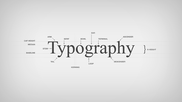
Now just in case you’re like me, first, what is typography?
Typography is the art and technique of arranging type to make written language legible, readable and appealing when displayed. The arrangement of type involves selecting typeface, point size, line length, line-spacing (leading), letter-spacing (tracking), and adjusting the space within letters pairs. The term typography is also applied to the style, arrangement, and appearance of the letters, numbers, and symbols created by the process. Type design is a closely related craft, sometimes considered part of typography; Type Design is the art and process of designing typeface.
I was reading at article on diversity in the design industry when I came across Joshua Darden as a premier type designer in the field. He is the founder of Darden Studios in New York and his work has been displayed all over the world.
Born and raised in suburban Los Angeles, Joshua Darden published his first typeface at the age of 15. He spent the next decade assisting in the development and production of typefaces for a broad range of commercial and cultural institutions. Since establishing his Brooklyn-based studio in 2004, he has collaborated with clients in dozens of markets to invent rich, communicative typography. Joshua has developed custom typefaces for Latin-based, Cyrillic, and Greek alphabets. He has lectured at the University of California Santa Barbara, has sat on panels at the TypeCon and South by Southwest Interactive conferences, juried the Type Directors Club Type Design Competition, and visited the Rhode Island School of Design as a Guest Critic. In addition to guiding the creative work of the studio, Joshua has taught at Parsons School of Design and School of Visual Arts. He is an avid amateur photographer, commuter by bicycle, and tireless collector, accumulating and cataloging books, small objects, and awesomely bad pop music.

Who knew? I did not realize this was a career option. I also didn’t think about the effect of type design on products and how that relates to me personally. Did you ever notice the font for all things relating to black people in the early 1900s? movie posters, books, everyday products like hair oil – did it ever occur to you that it was all the same? In my research on designers, I came across this 2004 article on Stereotypography and…well, just read!
New Black Face: Neuland and Lithos as Stereotypography
“The Neuland Question comes up regularly, and alas without much resolution….” —Jonathan Hoefler
The “Neuland Question” to which Jonathan Hoefler refers involves not just Neuland, a “display” typeface hand-carved in 1923 by Rudolf Koch (Plate 1), but also Lithos, another “display” typeface digitally created in 1989 by Carol Twombly (Plate 2). The Question can be put simply: How did these two typefaces come to signify Africans and African-Americans, regardless of how a designer uses them, and regardless of the purpose for which their creators originally intended them? The investigation of this question has four parts: first, an examination of the environments in which Koch and Twombly created the original typefaces; second, an examination of the graphic culture that surrounded African-Americans prior to the creation of Neuland through a close viewing of tobacco ephemera; third, an examination of the Art Deco (French Modern) style, the graphic culture most prevalent in the United States at the time of Neuland’s release; and finally, an examination of the ways designers use Neuland and Lithos today.
 Plate 1
 Plate 2
Rudolf Koch was born in 1876 and had a career that was both uninteresting and undistinguished until he enlisted in the German Army in 1907 to fight in World War I. Upon returning from the war, he commented to his close friend Siegfried Guggenheim that he was “profoundly stirred” by his experiences (10). The horrors of war inspired Koch to seek religion for himself and then preach the benefits of a religious life to his countrymen. Having experimented with the art of calligraphy shortly before enlisting, Koch returned to the art after WWI with the intention of making bold, noticeable typefaces that would shout to other Germans that following God’s path would help them find comfort from the trauma of war. Guggenheim notes, “Koch’s fonts after the war were designed for broadsides, postcards, etc.—not books…[they were designed] to demonstrate his religious fervency” (11-13). Neuland was such a face. Yale University Printer John Gambell suggests that Koch designed the face with the intent of making a modern version of the German black letter (or black face) style. Black letter fonts were used at the time for the setting of important texts, especially Bibles and church-related documents. Koch’s “new black face” attempted to preserve the flared, interlocking forms of the traditional black letter style, while at the same time adopting the sans-serif style around which modernists, like Paul Renner, were building their typefaces. Renner’s Futura, the quintessential example of modernist typography, was designed in 1927, only four years after the Klingspor Type Foundry released Koch’s Neuland (Rock).
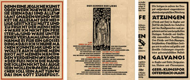
Koch’s settings of Neuland in the original German specimen book published by the Klingspor Type Foundry support Gambell’s suggestion. He sets the type with minimal leading and kerning as black letter was typically set (Plate 3). He inserts woodcuts and Greek cross-shaped (+) ampersands as well (Plate 4), a common practice with black letter texts. However, Koch broke with black letter typesetting standards by stripping Neuland of the delicately interlocking serifs commonly used in black letter typography. The result, a font composed of heavy black forms, was visible from great distances and easily distinguishable from lighter-weight typefaces on a page. These qualities made Neuland suitable to advertising. Koch even attempted to set a classified ad in Neuland at the end of the German specimen book (Plate 5).
 Plates 3, 4 & 5
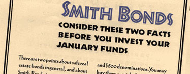
By the time Neuland reached the United States, its distributor, the Continental Typefounder’s Association, had little interest in Neuland’s uses as a modern black letter, and the specimen book that they prepared promoted Neuland as exclusively an advertising typeface, a “type that attracts attention” (Koch, Loose File, “Klingspor Type Foundry”). The American specimen book showed Neuland used in advertising settings from bank bonds to drywall contracting (Plate 6). Because of the absence of a black letter tradition in the United States and because of the way the Continental Typefounder’s Association promoted Neuland, Koch’s intentions for the font were entirely lost immediately after its introduction in America.
 Plate 6
Just as Koch was trying to modernize an ancient form of writing with Neuland in 1923, so too was Carol Twombly with Lithos in 1989. Jonathan Hoefler suggests that “Lithos [is] an interpretation of ancient lapidary writing.” Twombly herself corroborates this:
Inscriptions honoring public figures or dedications for temples were intended for public viewing in ancient Greece. Geometric letterforms, free of adornment were chiseled into the stone. These basic shapes are the inspiration for Lithos.
Letterforms like those that inspired Lithos can be seen not only on ancient Greek temples, but also on many modern buildings built in the Classical or Gothic styles, such as on the front entrance to Sterling Memorial Library at Yale University. In his famous book The Elements of Typographic Style, critic Robert Bringhurst notes that many modern typefaces take their inspiration from architectural sources, and, indeed, many of Twombly’s typefaces, like Lithos, come from ancient architecture: Trajan, a serifed face, evolved from carvings on columns in ancient Rome; and Charlemagne, another serifed face, evolved from carvings found in Byzantine temples.
Although Twombly left Trajan and Charlemagne relatively unaltered from their original forms, she made a substantial alteration in Lithos. Twombly decided to create a bold weight for Lithos in addition to its book weight, even though bold-weighted letterforms were nonexistent in ancient Greece. John Gambell suggests that Twombly “may have felt the font was not marketable today without a bold weight.” Regardless of her reasons, Lithos’ bold-weighted anachronism is now Neuland’s bastard child. Lithos’ flared edges, heavy lines, square characters, and pen-like strokes are analogous to Neuland’s trademark elements, and the fonts are virtually identical to the untrained eye. Indeed, Lithos’ close formal approximation to Neuland makes it virtually interchangeable with Neuland for designers working on African and African-American projects.
Because Lithos follows Neuland historically and formally, and because printers and designers used Neuland in African and African-American projects before Twombly even conceived Lithos, the resolution of the Neuland Question rests in reconstructing Neuland’s history.
Primarily because of both constant anti-African-American sentiment and the socioeconomic status of African-Americans during and after the Civil War, African-American graphic culture in the United States prior to Neuland’s release in 1923 and before the Harlem Renaissance in general was unimportant at best and nonexistent at worst. In short, African-Americans did not have the buying power or the social acceptance required to cultivate a significant graphic culture. What graphic culture they did have centered around their depiction in advertisements for products associated with slavery: tobacco and cotton.


