Tremendous amounts of ephemera surrounded the tobacco industry from the 1850s until the 1930s, much of which involved racist uses of African-Americans as mascots. Much of this ephemera took the form of trading cards given out in general stores, on street corners, or wherever tobacco was sold (Plate 7). These trading cards were common media for advertising from the 1850s to the 1930s, and generally involved a caricatured picture of a “Negro” and a slogan in dialect (“Sho’ fly, git away from dar”) on the front and information about the product on the back (Plate 8). As tobacco companies had to make these cards cheaply and copiously, the text on the back of these cards was often poorly set with cheap woodblock type rather than with more expensive metal type.
While today woodblock type has a certain nostalgic appeal, designers and typophiles (typographic historians and typography enthusiasts) into the 1950s saw woodblock letters as nothing but lower-class. Immediately upon its release, designers and typophiles linked Neuland’s forms with woodblock type and responded accordingly. In his book Typographic Milestones, typophile Allan Haley charges “Neuland is not considered a particularly practical, useful, or attractive typeface” (70). He later reiterates his point, saying, “[Neuland is] not especially attractive, nor even very useful…its realistic applications are quite limited” (73). Typophiles like Haley frequently omitted Neuland from typographic histories altogether, and Neuland soon became a member of the family of fonts that designers call “garbage type”: esoteric, inelegant, difficult to set, and destined, like tobacco ephemera, for the garbage. Neuland’s figurative status as “garbage type” became a literal truth when, as popular design legend has it, printers threw the face away after becoming frustrated with the extraordinary weight of the thick lead letters and the large amount of space the alphabet consumed in their often small print shops.
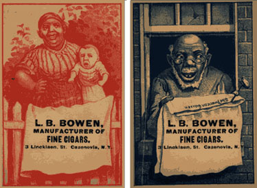 Plate 7
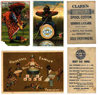 Plate 8
Apart from being perceived as cheap “garbage,” woodblock type carried with it a legacy of cultural stereotype. Woodblock type was also known as “circus type” because of its frequent use in promoting circuses. An entire culture of “stereotypography” developed around these playful woodblock typefaces as certain “circus types” came to stand for stereotypical visual associations that Americans held about the cultures that the “circus types” were designed to represent. For example, circus promoters used the woodblock type Tokyo when promoting performers from the Orient (Plate 9). Hometown, another “circus type,” is a near match for Neuland (Plate 10), as is Othello, a heavy (black) sign-lettering typeface whose name alludes to the black hero of Shakespeare’s tragedy (Plate 11).
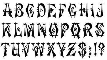 Plate 9
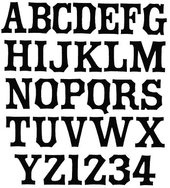 Plate 10
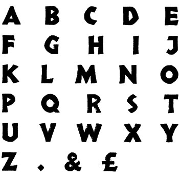 Plate 11
Beyond the circus’ stereotyping of non-Western cultures via woodblock type, cigarette packages, in addition to their advertising, often employed stereotyped and racist themes on their packaging. Two cultures often stereotyped were Egypt (on the packages of Oasis, Café-Noir, Zima, Egyptian Heroes, and Crocodile cigarettes) and Turkey (on the packages of Fatima, Omar, and Turkey Red cigarettes) (Plate 12). The dominance of these cultures in antiquity ties them to Lithos’ Greek forms. Their use on cigarette packaging ties them to Neuland. Finally, their status as cultural “Others” to the West, in the same way that Africa was seen as a cultural “Other,” figures prominently into determining the cultural implications of the Neuland Question. Jonathan Hoefler explains,
I suspect that designers who use Neuland or Lithos as an approximation of the Africanesque are being unimaginative at best, and jingoistic at worst. [This use of] Neuland…still survives on that appalling cigarette package [1].
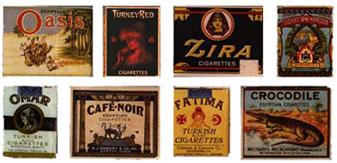 Plate 12
Before Neuland’s release, the graphic culture of African-Americans exemplified by trading cards, “circus type,” and cigarette packaging typified the racial and socioeconomic stereotype of the “Po’ Negro.” However, the extent to which that attitude continued, and whether the predominant graphic culture in America at the time of Neuland’s release, Art Deco, altered that attitude, remains to be discussed.
Art Deco, a school of art that “responded to the changing taste of society during the ‘Jazz Age’” (Janson 856), started in France shortly after 1900, but its development was postponed until after WWI, when, in 1925, the French dubbed it Le Style Moderne. This is why Art Deco was also known as the French Modern style. This name existed for a short time, but as the style became more international it came to be known as “Art Deco,” getting “Deco” from “decorative,” since the style applied mainly to the decorative (rather than high) arts. Thus, Art Deco, like the woodblock and “circus” typography that came before it, was considered lower-class. Art Historian Anthony F. Janson echoes this point, “[Art Deco’s] everyday objects catered to the lowest common denominator” (856). Having grown up in France around the turn of the century, Art Deco adopted much of the fantasy of Art Nouveau. Oftentimes this fantasy included “a taste for the exotic…[including] ancient Egypt” (Janson 856). Like cigarette packaging that drew much from ancient Egypt, Art Deco’s Egyptian elements drew heavily on stereotyping the “Other,” a category that included Africa. Finally, Art Deco’s references to “primitive” cultures like Africa created a romanticized ideal that echoed references to “primitive” cultures made by the Primitivists in France a generation before.
Primitivist and Art Deco elements show up in Koch’s own work. In terms of Primitivism, two histories of Koch, Friedrich Matthaus’ Rudolf Koch, ein Werkmann Gottes, and Oskar Beyer’s Rudolf Koch, ein schopferisches Leben include drawings and photographs of Koch’s sculpture, which is nothing if not Primitivistic (Plate 13). Like much of African sculpture, Koch’s sculpture is carved out of dark wood and supported by small animal figurines. Koch savagely scratched out Christian messages into the sculptures in a typeface remarkably similar to Neuland. Koch created Neuland in a similar fashion, creating the letterforms by carving them directly on the metal punches (type blocks), rather than making drawings from which to work (Haley 73). In its original metal version, each character set of Neuland was subtly different from all the others; this wonderful quality has been lost since the type’s adaptation into phototype and then digital forms.
 Plate 13
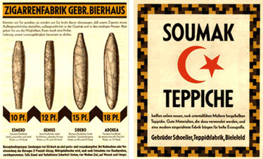
Apart from Neuland, typophiles commonly group another of Koch’s typefaces, Kabel, with Art Deco fonts. Kabel’s quirky lower-case “e” and upper-case “G,” and the entire face’s low x-height position it squarely in the Art Deco typographic aesthetic. Kabel’s German specimen book includes a number of interesting suggestions for its use, most notably for a page of cigar advertisements (Plate 14). The following page continues the tobacco merchandise theme as it predominantly displays a Turkish star-and-crescent symbol (Plate 15).
 Plates 14 & 15
Though Neuland is not technically an Art Deco typeface, many typophiles group it with Art Deco typefaces anyway. In his Advertising Typographers of America Type Comparison Book, typophile Frank Merriman groups Neuland under the heading “Informal Sans” with true Art Deco faces such as Banco, Studio, Cartoon, Ad Lib, and Samson [2] as well as the sign-lettering face Othello discussed earlier. On the page facing the “Informal Sans,” he shows some Greek pottery fragments found in Corinth from the second half of the 8th century BC (Plate 16). Although Koch was fascinated by Greek lettering—Matthaus’ book displays lettering Koch drew in the manner of Greek tablets (Plate 17) and a book about Koch bears some of his hand-drawn Greek letterforms (Plate 18)—Merriman’s comparison is not based on this fact. He explains the juxtaposition of the “Informal Sans” and the Greek pottery fragments in this way:
These [fragments] are nearly as old as any Greek inscription or writing found to date. Their informal nature, whether through ineptitude or choice,is remarkably like that of our informal sans-serifs nearly three milleniums later (71, emphasis mine).
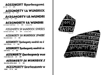 Plate 16
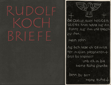 Plates 17 & 18
Merriman’s juxtaposition clearly links Neuland and Lithos to one another and to the formal aesthetics of Art Deco, which were positioned in the lower-class and tied to antiquity and stereotypical views of the “Other.” Merriman’s use of the word “informal” to describe the faces marks the cultural snobbery typophiles displayed toward Neuland and faces like it [3]. Merriman explicitly suggests this quality by calling the “Informal Sans” “inept.” Implicitly, he suggests it by his name for the group, “Informal Sans.” “Informal” here means “not according to prescribed, official, or customary forms; irregular; unofficial; suitable to or characteristic of casual or familiar speech or writing” (Urdang 683). “Informal” is inartistic, lower-class, and outside the establishment. “Informal” is Merriman’s judgment of American society’s perception of African-American art and, indeed, of African American people themselves.
The book publishing world of the 1920s, 30s, and early 40s, well-versed in Art Deco, did nothing if not underscore the culturally stereotypical qualities that Neuland had already assumed. Book publishers often mockingly coupled the font’s use with titles like “Illiterate Digest,” “Cannibal Cousins,” and, in a visual pun, with the pulp fiction mystery “The Case of the Black-Eyed Blonde” (Plate 19, emphasis mine).
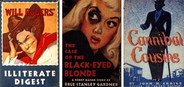 Plate 19
By the mid-1940s, long after Art Deco had left, Neuland’s use in African-American texts remained. Famous African-American books such as Richard Wright’s Native Son and Wulf Sachs’ Black Anger (Plate 20) use Neuland on their covers. Critic Ellen Lupton notes, “Neuland has appeared…on the covers of numerous books…about the literature and anthropology of Africa and African-Americans” (37). Even today, books that fit into the category that Lupton outlines bear Neuland or Lithos on their covers (Plates 21). While the stereotypes associated with the fonts have remained, their applications have, in fact, increased in the present day beyond just book publishing. Neuland has found its way into Hollywood, used in such films as Jurassic Park, Tarzan, and Jumanji. Subaru used Lithos prominently in the logo for their new car, the Outback. Both fonts appear frequently on all sorts of extreme sports paraphernalia. These uses seem to indicate that in addition to Neuland and Lithos’ prior associations with informality, ineptitude, ugliness, cheapness, and unusability, they have since acquired qualities that suggest “jungle,” “safari,” and “adventure”—in short, Africa. Moreover, “stereotypography”—the stereotyping of cultures through typefaces associated with them—has been increasing as graphic design becomes a greater cultural force: just this year, House Industries, a type foundry in New Jersey, released a family of typefaces called “Tiki Type,” which is meant to signify Polynesia (Plate 22); at the same time, Abercrombie & Fitch, a clothing store catering to twentysomethings, created shirts with meaningless Chinese ideograms on them, meant to look as if they came directly from New York’s predominantly Chinese garment district.
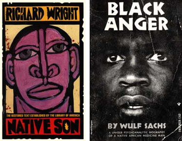 Plate 20
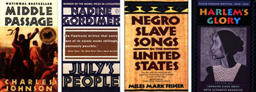 Plate 21
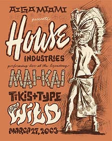 Plate 22
But away from the white-controlled industries of book publishing, movie making, car dealing, adventure seeking, font designing, and designer clothing, in small African-American-controlled sectors of business and culture, no sign of Neuland or Lithos appears. The first issue of Ebony magazine takes more from the classic 1950s typography of Life magazine than from African-American books published at the same time, and other African-American magazine published before Ebony like Common Ground and Lamplighter do the same. Jazz album covers from labels like Blue Note and Verve are steeped in the playful modernism of designer Saul Bass and employ modern typefaces revamped, like Futura, Trade Gothic, and Clarendon, in ways that melt their Modernist frigidity and heat them with the hot beat of Jazz. From Motown in the 1970s to the Fugees today, African-American musicians do not simply ignore Lithos and Neuland on their album covers-they have excised them completely from their visual vocabulary.
As Michael Rock points out, an intrinsic difficulty confronts all designers as they set out to design new cultural texts with the tools of old Modernist typography. “Inevitably,” he observes, “you end up having to refer to other aesthetic systems, and those systems are subject to stereotype.” However, African-Americans from Common Ground to the Fugees seem comfortable reinventing old Modernist typography in new ways rather than developing new, separate systems. Indeed, typography today is still a separate-but-equal world, and prominent African American authors like Terrance McNally still have their work branded as “different” simply as a result of the typeface used on the cover. If, as John Gambell suggests, the typefaces we as a society choose in which to set our messages are meant to stand in for the speaker of the words themselves, than how should we see a speaker with Koch’s “new black face”? If we want to know why the words of African-Americans continue to be lost, we must come to recognize that the “new black face” that voices in Neuland adopt is not a new face at all: it is simply a mask for the old black stereotypes that still persist today.
From Letterspace Fall/Winter 2004.
